Independent Labs - Page Layouts with Material-UI
July 09, 2019
Page Structure
Because I’m working on the frontend prior to the backend for this project, my first task is to create page layouts for each page in the App.
This departs substantially from basic HTML/CSS.
If the page was being built with HTML/CSS, I’d use semantic markup. You’d have your familiar structure like so:
<html>
    <head>
        <meta>
        <title></title>
        <link>
    </head>
    <body>
        <div class="container>
            <section class="main">
            </section>
            <section class="mid">
            </section>
            <section class="bottom">
            </section>
            <footer class="footer">
            </footer>
        </div>
    </body>
    <script src="js/index.js"></script>
</html>
Not only is this project built with React, with JSX, being close enough to semantic markup, I’ve deliberately used Material-UI meaning that there’s a certain logic to page layouts.
As discussed in a previous post I’m starting off with a Higher Order Component (HOC) approach to Material-UI styling, which allows me to create each component as a “class” component.
Understanding this isn’t necessarily the Material-UI way nor is it the React Way given the momentum behind React Hooks.
Nevertheless, since there won’t be too many parent-child levels to pass down props, I’m starting the project off with “class” components and will transition to passing Authentication/Authorization functions down via React Context after mvp.
As such, I’m finding that the best (for now) way for structuring a page in the initial phase is to use a combination of Contrainers, Grid Containers, Grid Items and Papers per Material-UI components. Here’s how a basic set-up might look:
import React from 'react';
import Container from "@material-ui/core/Container";
import Grid from "@material-ui/core/Grid";
import Paper from "@material-ui/core/Paper";

import { withStyles } from "@material-ui/styles";

const styles = {
    container: {

    },
    mainGrid: {

    }
}

class SampleComponent extends React.Component {
    render(){
        const { classes } = this.props;
        return (
            <div>
                <Container className={classes.container}>
                    <Grid container spacing={3} className={classes.mainGrid}>
                        <Grid item xs={12} md={6}>
                            <Paper elevation={0} className={classes.topbar}>
                                Placeholder Text
                            </Paper>
                        </Grid>
                        <Grid item xs={12} md={6}>
                            <Paper elevation={0} className={classes.sidebar}>
                                More Placeholder Text
                            </Paper>
                        </Grid>
                    </Grid>
                </Container>
            </div>
        )
    }
}

export default withStyles(styles)(SampleComponent);    // HOC
The useful thing about Material-UI’s grid system is that it is flexible enough to structure any page layout and it is responsive. The Grid System - Grid Container + Grid Item - take a bit of studying, but Material-UI’s sample project provides nice guidance.
I should mention Material-UI’s documentation is excellent.
Components that are rendered must simultaneously be styled.
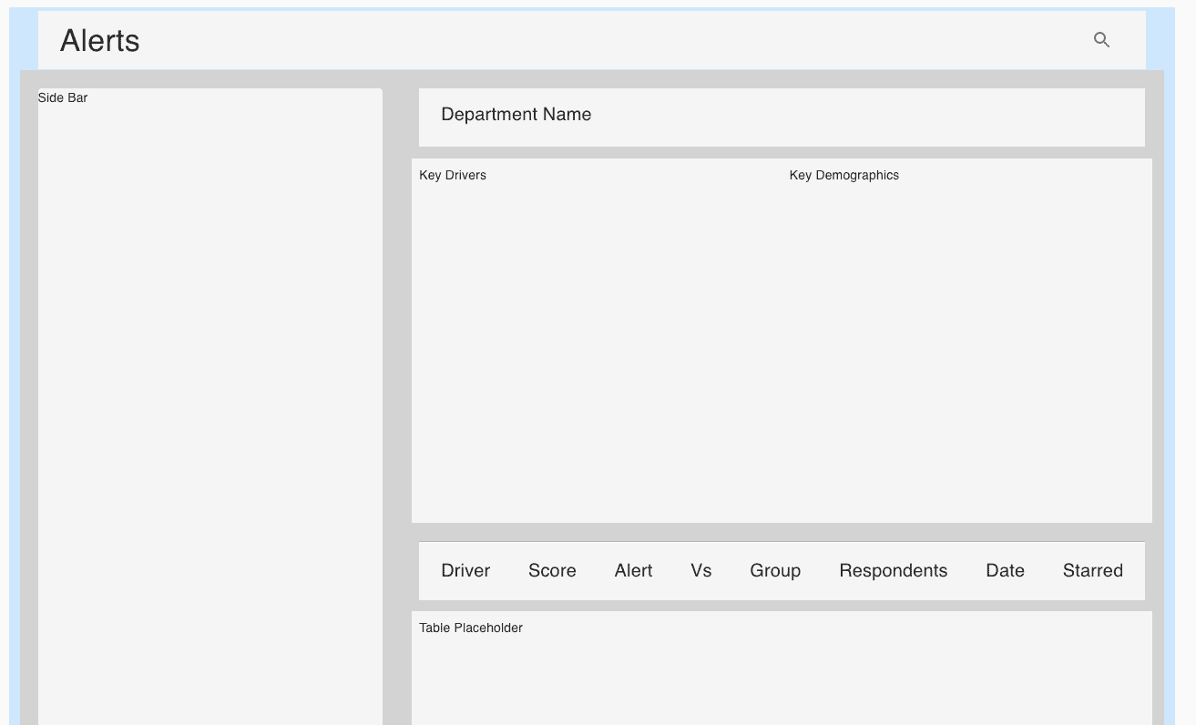
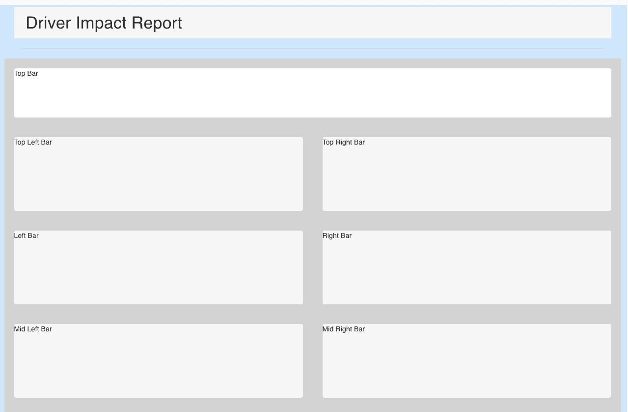
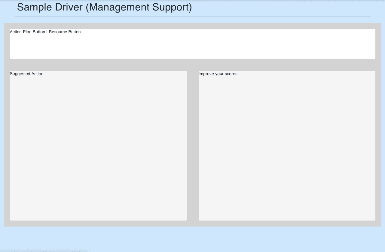
Example Page Layouts
Alerts
Driver Impact Report
Action Plan
Material-UI provides a lot of flexibility for styling and structuring pages as Bootstrap does for CSS, except within the context of React.

Written by Paul who lives and works in Bangkok building useful things. You should follow him on Twitter